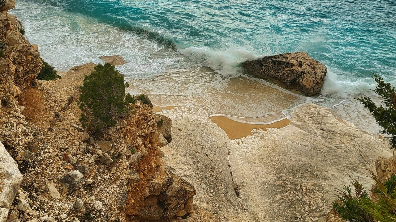
Cala Goloritzé, Sardinia by Alice Rose
When someone visits a website for the first time, how do we capture their attention? The answer is simple: we make it pretty yet professional.
A dull site is never going to engage visitors or encourage them to explore further—and neither is a blog that doesn’t look like they know what they’re talking about. So, this week’s task was designing a homepage for my travel blog that is both captivating and informative. Here’s a quick look at the three key elements I tackled: displaying my blog title and choosing a tagline, designing the homepage layout, and setting up the main menu.
Titling my blog and choosing a tagline
As you might remember, I chose the name Arexploring for my travel blog previously as it reflects my initials (AR – Alice Rose), and plays on the idea of “our exploring,” which ties in nicely with the theme of travel. However, as I also discussed previously, I knew that a strong tagline would enhance SEO and give visitors a clear idea of what my blog is about. Hence the front page of my website now reads: “Arexploring – Your Guide to Authentic European Travel Experiences.” I believe this tagline perfectly encapsulates the essence of my blog and its focus on European travel.
Designing an Aesthetic and Informative Homepage
Next, I wanted my homepage to be visually striking and directly related to my content. As a passionate travel photographer, I dug through my albums and found some stunning visuals from my recent trips. I chose a popular video from my Instagram of Cala Goloritzé in Sardinia as the centrepiece, greeting visitors with a captivating view. Below, I added an “Explore Now” button overlaying an image of the Amalfi Coast, leading users straight to my latest blog posts. To make the homepage even more informative, I included a section that outlines what readers can expect from my blog and an image carousel that I plan to link to specific country pages in the future.
Creating the Main Menu
Every time I think I’ve done the hardest part of making my website and I can finally start writing … I’m wrong! I hate to admit it, but I battled with the Main Menu for hours. You see, to create a menu from scratch, you have to navigate your way through your site customisation and add specific pages that link to the corresponding titles. Now I’ve done it, I realise I made it a lot harder for myself by trying to craft a complex menu with many different titles—the best thing to do, especially if you’re a beginner like me, is to keep it simple. After all, a complicated website can frustrate visitors and cause them to leave. I ultimately settled on a clean, user-friendly menu with four main sections: Home, Travel Blog, About, and Contact. This setup allows me to keep my content organized under the Travel Blog section, which I can later expand to include different destinations or types of posts, while also providing essential navigation and information.
Stay tuned for the next post as I continue my journey of building Arexploring!


