After securing my domain and setting up the foundation for my travel blog, Arexploring, it was time to dive into customization. This phase began with choosing a theme that would define the look and feel of my site.
Selecting the Perfect Theme
A website theme serves as the skeleton design for your site’s appearance, setting the stage for how visitors will experience your content. To find the right theme, I explored various options directly from my website’s GoDaddy Dashboard under the ‘Appearance’ section. After much deliberation, I chose a theme called ‘Inspiro’ for its sleek design and the ability to showcase both video content and written posts, perfectly aligning with my vision for the blog.
Designing the Logo: A Journey of Creativity
Next, I turned my attention to crafting a logo—a symbol that would represent Arexploring across all platforms. Designing this logo has been one of the most challenging yet rewarding parts of the process so far.
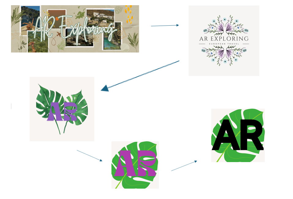
I began with intricate designs on Canva, incorporating shapes and personal photos. However, when I previewed my favourite version as a site icon, it became clear that the details were lost at smaller sizes. This led me back to the drawing board, where I studied the logos of familiar brands like LinkedIn, Google, or logos of brands that inspire me like, Condé Nast Traveller, for example. The common thread? Simplicity and boldness.
Therefore, I returned my thoughts to my own goal of crafting a travel blog. I reflected on what travel means to me—nature, finding a home away from home. Growing up surrounded by the countryside, trees, and woodland, the symbol of a leaf has always represented home for me. Even as I’ve travelled and lived abroad, I’ve sought out nature as a comforting reminder of my roots. Moreover, this deep connection inspired me to choose a simple leaf design for my logo.
Combining the leaf with my initials, AR, I experimented with various colours and layouts determined to build a unique logo that would also be easy to spot. At first, I thought about using complimentary colours and the colour theory wheel to make my logo really pop. Thus, as my leaf shape was green, I choose an opposing pinky-red for my initials. While this combination initially seemed like a good idea, it didn’t achieve the visibility I wanted as a site icon. Ultimately, after much deliberation, I opted for black initials against the green leaf—a classic combination that stands out clearly.
Final Thoughts and Next Steps
Although my logo might evolve as Arexploring grows, I’m content with where it stands now. It’s a small but significant step in bringing my vision to life.
Check out the images below to see the progression of my logo design. I’d love to hear your thoughts—what does your logo symbolize to you? Stay tuned for the next chapter in my journey!

